Learning to code is hard, but at least the process is pretty cut and dry. If you’re interested in a particular topic, you can read about it (on Wikipedia, books, docs, etc.), watch a YouTube video or two, and put your newfound knowledge to use by solving a specific problem. Rinse and repeat until you get good at it. With coding, it’s usually pretty easy to gauge if you’ve successfully learned and retained a specific concept.
But after reading Refactoring UI to learn some basic web design principles, I noticed that the process isn’t as straightforward with UI/UX stuff. Design work is basically applied art, so what makes a particular design “good” or “bad” (mostly) depends on who you ask. That said, the book does provide some great ideas for approaching web design methodically. And when used to implement a full-fledged design system, these principles can level up your UIs in ways you might not have thought possible.
Key principles for simplifying UI design
At its core, a good UI is all about usability and consistency, not about following trends or expressing your innate artistic talent. Your app’s visual identity should follow its functionality, and not the other way around. The good news is that building usable and consistent UIs only requires following a few basic rules.
For example, here’s a great tip from the book for when you’re starting from scratch.
Hold the color. By designing in grayscale, you’re forced to use spacing, contrast, and size to do all of the heavy lifting. It’s a little more challenging, but you’ll end up with a clearer interface with a strong hierarchy that’s easy to enhance with color later.
The book is filled with these great tips to get you moving faster. If your app’s still in its design phase and you haven’t built any features yet:
Be a pessimist. Don’t imply functionality in your designs that you aren’t ready to build. If part of a feature is a “nice-to-have”, design it later.
Designing everything in one go, getting it off the table, and not having to worry about design again is tempting for us developers. However:
Don’t over-invest. Design in low-fidelity so that you can move fast, try out several iterations, and start building the real thing as soon as possible.
Here is a great one that was definitely a clear inspiration for Tailwind CSS:
Define systems in advance. Don’t hand-pick values from a limitless pool any time you need to make a decision. Start with a smaller set of options. Need a new shade of blue? Don’t reach for the color picker—just choose from a set of 8-10 shades picked out ahead of time.
And here is one of my favorite tips.
Use visual hierarchy. Deliberately de-emphasize secondary and tertiary information and make an effort to highlight primary elements. The result is immediately more pleasing, even though the color scheme, font choice, and layout haven’t changed.
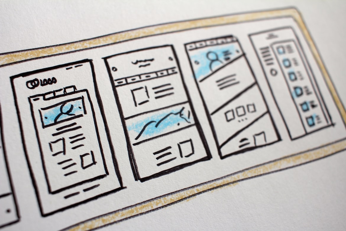
I tried to incorporate as many of these tips as I could during the design phase of LuccaNotes, a Next.js-based Markdown note-taking app. Below is the Figma file I created with all of the various iterations of the desktop and mobile designs for LuccaNotes.
Heading from left to right, you can see how I started designing the UI in grayscale and only much later added in color. I created several iterations for each page, trying out new layouts, adjusting the visual hierarchy in the page and inside individual components, and removing redundancies, all while trying to stick to Tailwind’s defaults.
Building a design system
A very important step in designing your UI is building an accompanying design system. If the “define systems in advance” tip above will help you standardize CSS-level stuff like spacing scales, fonts, and colors for our app, then full-blown design systems will help standardize things at the component level.
Take a button component, for instance. The button’s functionality is generally well understood: you click it and something happens. But you can take advantage of a design system to hint at what that something is, thus making your UI feel more intuitive and usable.
- You could create variants based on the button’s intent: primary, secondary, success, danger, or hyperlink.
- You could even create size variants, if appropriate: large, regular, or small.
- Buttons could also have an optional icon alongside the label, or omit the label entirely and just use a large icon and a pop-up tooltip instead.
You can make design systems as simple or as complicated as you want, so I tried not to get too bogged down by the details during the design phase. But when in doubt, just keep it simple for now. I’d probably have given up on the project entirely if I had to design every single button variant before writing any code.
Design systems in Figma
It’s much easier to make changes to your design if you’re building prototypes using Figma (or similar tools like Sketch or even Photoshop) instead of jumping straight into code. I don’t consider myself to be an advanced Figma user, but I’ve learned some basic tricks to build design systems there too, thanks to Chris Pennington’s great video titled Figma for Developers. He talks about five key Figma features to learn when building proper UI prototypes: grid layouts, styles, constraints, frames/auto-layouts, and components.
And as far as design systems go, Figma components in particular are by far the most important feature you’ll use because they closely mirror the actual components you’ll build in your favorite JavaScript UI framework. Component properties are pretty much the same as props, and you can create multiple variants for your components using variants and instance swap properties.
Class Variance Authority
Class Variance Authority (CVA) is a great library for building design systems, especially when used in combination with TypeScript, Tailwind CSS, and your component-based JS framework of choice.
With CVA, we can describe what variants our component has, common styles for all variants, styles that apply to a specific variant, default variants, etc. Here’s an example for a simple button component:
// components/button.tsx
import { cva } from "class-variance-authority";

const buttonStyles = cva("font-semibold rounded border", {
  variants: {
    intent: {
      primary: "bg-blue-500 text-white border-transparent hover:bg-blue-600",
      secondary: "bg-white text-gray-800 border-gray-400 hover:bg-gray-100"
    },
    size: {
      small: "text-sm py-1 px-2",
      medium: "text-base py-2 px-4",
    },
  },
  defaultVariants: {
    intent: "primary",
    size: "medium",
  },
});
CVA will then generate type-safe props for the variants we’ve created. We can merge these variant props with our component props (a label, an onClick handler, and an icon, for example) and can even use TS utility types to ensure certain props are required. Then, we can build out the actual button component as usual, like so:
// components/button.tsx

const buttonStyles = cva(/* see snippet above... */)

// regular button props
type ButtonProps = {
  label: string;
  onClick?: (onClickProps: any) => void;
  icon?: IconType; // defined elsewhere, pretend this is JSX
}

// merging button props and CVA variant props with TS utility types
type buttonVariantsProps = VariantProps<typeof buttonStyles>;
interface Props
  extends ButtonProps,
    // making intent variant required
    Omit<buttonVariantsProps, "intent">,
    Required<Pick<buttonVariantsProps, "intent">> {}

// actual button componenent
const Button = ({label, onClick, icon, intent, size}: Props) => {
  return (
    <button
      className={buttonStyles({intent, size})}
      onClick={onClick}
    >
      {icon && <Icon/>}
      {label}
    </button>
  )
}
I believe this is really great and scalable way to build out your design system. It also solves a common gripe that a lot of folks have with Tailwind CSS: the fact that your styles are basically tangled up with your markup. With CVA, not only do you achieve separation of concerns (styling/design vs. logic/markup), but your styling becomes a lot more versatile too.
Conclusion
You don’t have to be a naturally gifted artist to make websites and apps that look nice. Some creativity can help, but designing around features rather than aesthetics will get you much further.
Planning out your UI in advance, prototyping and building design systems will let you double down on making your apps more usable and visually consistent (and pleasing!), leading to an overall better user experience.
If you haven’t tried using some sort of design system yet, this is your chance. Tru Narla, a Twitch streamer and frontend software engineer at Discord, did a great overview of CVA during her talk at Next.js Conf 2022. Go check it out for more juicy details on CVA, and let your imagination run wild!
That’s all I’ve got for now. Peace ✌