Ever since I got back into web development some 6-ish weeks ago I started looking for ways to brush up on my HTML and CSS. I enrolled in Scrimba’s Learn React for free course but I was still feeling a bit rusty and I wanted to get some practice before diving deeper into React.
As luck would have it, I stumbled into Alana, a fellow Scrimba coder who was solving a web dev coding challenge from Frontend Mentor live on Twitch. One look at their collection of project challenges, and I was hooked. I’ve now been building FEM’s projects for a little over a month and my frontend skills have improved drastically. 🙂
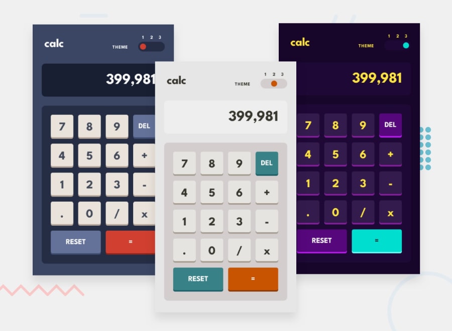
This week I finished this cool multi-theme Calculator app challenge and I even managed to write my own algorithm from scratch to mimic the behavior of the iPhone’s classic calculator app. Wanna know how I did it? Keep reading to find out!
Warning - there will be a fair amount of React lingo in the coming sections, but I’m sure you already saw that coming. 😜
You can also try out the calculator for yourself or view the full source code on GitHub.
Getting started
Setting up React + Vite
I decided to build this project with React and Vite. If you’re reading this article, I’m sure you’re already familiar with both, but in case you aren’t:
- React is a JavaScript library for building highly interactive web UIs in a declarative fashion
- Vite is both a JS source code bundler built on top of Rollup and a high-performance dev server with HMR and other cool stuff under the hood
The best way to try out Vite is by following the official guide. If you’ve already built a React project with Create React App, then you’ll be glad to know Vite is a drop-in replacement for CRA - it scaffolds a basic React app and adds all the basic dependencies, and all you need to do is install them with NPM/Yarn and get to coding.
Vite is fast - like, really fast - and honestly, you should probably consider ditching CRA in favor of Vite for your future React projects.
FEM Starter Files
Frontend Mentor offers both Sketch and Figma designs if you sign up for their Pro tier. Free tier peasants like us only get the free starter files: assets (images, logos, SVG icons, etc.), design previews, and a basic style guide with fonts and colors. You can get the starter files for this project by visiting the challenge page on Frontend Mentor’s website.
FEM’s free style guides are okay at best, but you’ll still have to guess a lot of stuff to get your layout right. One way to reduce the guesswork is to use graphics software like Inkscape and analyze the design previews - this way you can get the correct height, width, margin, and padding values for your DOM elements.
Layout and CSS
As much as I’m a big fan of coupling your UI with styling (i.e. Vue SFCs, styled-components or Tailwind), implementing visual layouts and building UI components are still fundamentally different problems. Big shocker: planning your layout is usually easier compared to designing your UI logic, so start with the former!
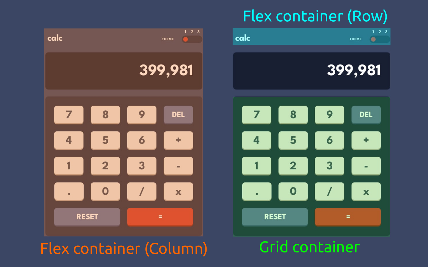
As shown above, a smart combination of Flexbox and Grid can achieve our desired layout. A vertical Flex container can wrap the entire calculator, while a horizontal Flex container can wrap the header elements. The keypad can use a simple 4x5 Grid, and the larger “RESET” and ”=” keys can be positioned with Grid areas.
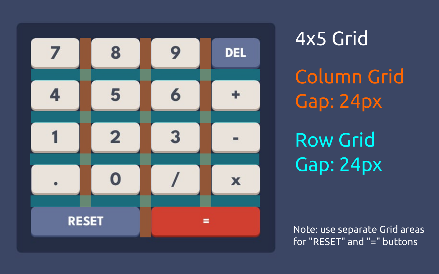
Additionally, by using Inkscape, you can draw neon-colored rectangles with reduced opacities (<50%), lay them over elements of the design preview, and adjust the rectangles’ edges to match your target element to get the values you want. I used this method in the example above to get the Grid row/column gaps for the keypad, which are both ~24 pixels.
Using React Context for the themes
According to the official React docs:
Context provides a way to pass data through the component tree without having to pass props down manually at every level.
In a typical React application, data is passed top-down (parent to child) via props, but such usage can be cumbersome for certain types of props (e.g. locale preference, UI theme) that are required by many components within an application. Context provides a way to share values like these between components without having to explicitly pass a prop through every level of the tree.
Context is designed to share data that can be considered “global” for a tree of React components, such as the current authenticated user, theme, or preferred language.
Well, there you go, using Contexts in React is a perfect way to implement themes! Once you set up your theme context, you can use the current theme value in any component since it’s treated as a “global” piece of app state.
The docs mostly show Contexts in class-based components, but since we’re cool kids 😎, we only build apps with functional components - so instead take a look at the Context hook API reference for more information on the topic.
I’ll show you a real-world implementation of contexts and multiple themes in the following section, so keep reading!
Building out the components
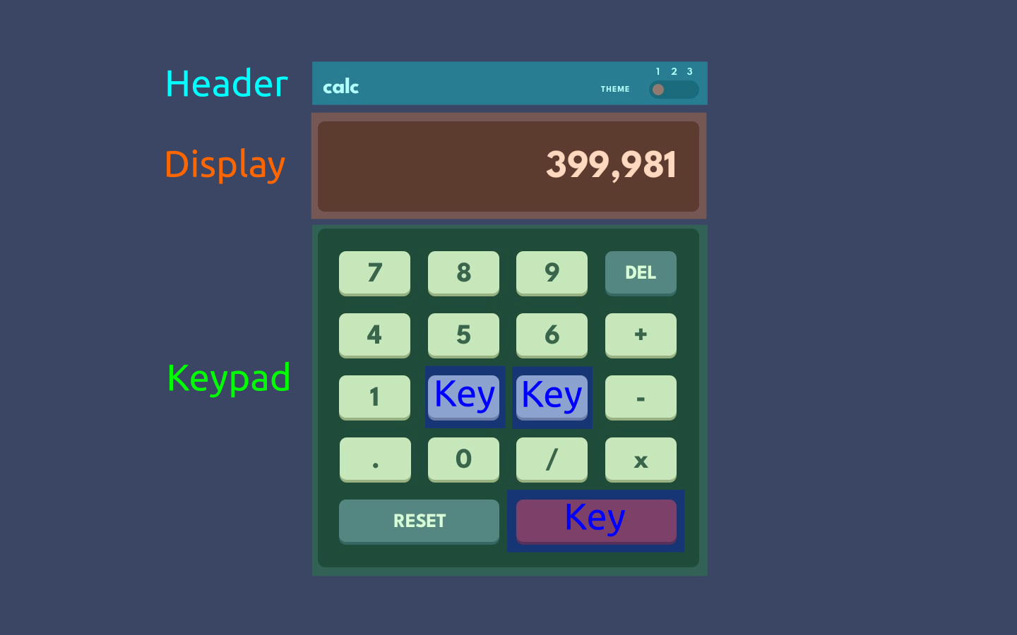
Here are all my custom components overlaid on the design preview so you can have an idea of which UI elements they represent.
Main App component
But before we take a look at custom components, it’s worth taking a look at how they’re composed inside the top-most <App/> component.
// App.jsx

import React, { createContext, useEffect, useState } from "react";

// components
import Header from "./components/Header";
import Display from "./components/Display";
import Keypad from "./components/Keypad";

// theme stylesheets
import './css/theme-1.css'
import './css/theme-2.css'
import './css/theme-3.css'

// context for themes
export const ThemeContext = createContext();

function App() {

  // state
  const [theme, setTheme] = useState(1);
  const [primary, setPrimary] = useState('');
  const [secondary, setSecondary] = useState('');
  const [operator, setOperator] = useState(false);
  const [previous, setPrevious] = useState('');

  // ------------------------------------------------
  // various functions, hooks, and event handlers...
  // ------------------------------------------------

  return (
    <ThemeContext.Provider value={theme}>
      <main className={`main theme-${theme}-main`}>
        <div className="calc">
          <Header setTheme={setTheme} />
          <Display value={primary} />
          <Keypad
            addChar={addChar}
            delChar={delChar}
            reset={reset}
            handleOperator={handleOperator}
            handleEquals={handleEquals}
          />
        </div>
      </main>
    </ThemeContext.Provider>
  );
}

export default App;
Header
The <Header/> component represents the the tiny “calc” logo in the top-left corner as well as the theme toggle at the top-right corner. The toggle itself is made of 3 “ghost” (i.e. invisible) divs that represent the 3 different toggle positions as well as a visible toggle switch indicating the currently selected theme.
It takes only a single prop: a setState-type function to set the theme state variable in <App/>, depending on which “ghost” element in the theme toggle was clicked.
// header.jsx

import React, { useContext } from "react";
import { ThemeContext } from "../App";

function Header({ setTheme }) {

  const theme = useContext(ThemeContext);

  const positions = [5, 28, 50];

  const style = {
    left: `${positions[theme-1]}px`
  }

  return (
    <header className="header">
      <p className={`header-logo theme-${theme}-header-logo`}>calc</p>

      <div className="header-switch">
        <p className={`header-switch-prompt theme-${theme}-header-switch-prompt`}>Theme</p>
        <div className={`header-switch-container theme-${theme}-header-switch-container`}>

          {/* actual visible toggle */}
          <div style={style} className={`header-switch-slider header-switch-toggle theme-${theme}-header-switch-toggle`}></div>

          {/* ghost slider positions */}
          <div
            className="header-switch-slider ghost ghost-1"
            onClick={() => setTheme(1)}
          ></div>
          <div
            className="header-switch-slider ghost ghost-2"
            onClick={() => setTheme(2)}
          ></div>
          <div
            className="header-switch-slider ghost ghost-3"
            onClick={() => setTheme(3)}
          ></div>

          {/* slider position text indicators */}
          <div className="header-switch-positions">
            <p className={`header-switch-position theme-${theme}-header-switch-position`}>1</p>
            <p className={`header-switch-position theme-${theme}-header-switch-position`}>2</p>
            <p className={`header-switch-position theme-${theme}-header-switch-position`}>3</p>
          </div>
        </div>
      </div>
    </header>
  );
}

export default Header;
Display
This is the simplest component of all - it just takes in a prop with the value to be shown in the calculator’s display.
// display.jsx

import React, { useContext } from 'react'

import { ThemeContext } from '../App';

function Display({value}) {

  const theme = useContext(ThemeContext);

  return (
    <div className={`display theme-${theme}-display`}>
      <p className={`display-text theme-${theme}-display-text`}>
        {value[value.length-1] === '.' ? value : parseFloat(Number(value).toFixed(7))}
      </p>
    </div>
  );
}

export default Display
Keypad
This is the parent component for the calculator’s actual keys - it doesn’t take any special props other than various event handler functions that will be passed down to the appropriate <Key/> child components.
// keypad.jsx

import React, { useContext } from "react";
import { ThemeContext } from "../App";
import Key from "./Key";

function Keypad({ addChar, delChar, reset, handleOperator, handleEquals }) {

  const theme = useContext(ThemeContext);

  return (
    <div className={`keypad theme-${theme}-keypad`}>
      <Key text="7" onClick={() => addChar(7)}/>
      <Key text="8" onClick={() => addChar(8)}/>
      <Key text="9" onClick={() => addChar(9)}/>
      <Key text="del" type={1} onClick={() => delChar()}/>
      <Key text="4" onClick={() => addChar(4)}/>
      <Key text="5" onClick={() => addChar(5)}/>
      <Key text="6" onClick={() => addChar(6)}/>
      <Key text="+" onClick={() => handleOperator(0)}/>
      <Key text="1" onClick={() => addChar(1)}/>
      <Key text="2" onClick={() => addChar(2)}/>
      <Key text="3" onClick={() => addChar(3)}/>
      <Key text="-" onClick={() => handleOperator(1)}/>
      <Key text="." onClick={() => addChar('.')}/>
      <Key text="0" onClick={() => addChar(0)}/>
      <Key text="/" onClick={() => handleOperator(3)}/>
      <Key text="x" onClick={() => handleOperator(2)}/>
      <Key text="reset" type={1} area="reset" onClick={() => reset()}/>
      <Key text="=" type={2} area="equals" onClick={() => handleEquals()}/>
    </div>
  );
}

export default Keypad;
Key
This component represents the actual clickable keys. It takes in props for the text to be displayed, an onClick() event handler as defined by the parent <Keypad/> component as well as what type of key this is (this is just used for styling purposes).
Type 0 means a regular key (hence 0 being a default value), 1 is for the “DEL” and “RESET” keys, and 2 for the ”=” key.
// key.jsx

import React, { useContext } from "react";
import { ThemeContext } from "../App";

function Key({ text, type = 0, area = "", onClick }) {

  const theme = useContext(ThemeContext);

  return (
    <div
      className={`
        key theme-${theme}-key
        ${type === 1 ? `key-type-1 theme-${theme}-key-type-1` : ""}
        ${type === 2 ? `key-type-2 theme-${theme}-key-type-2` : ""}
        ${area !== "" ? `key-area-${area}` : ""}
      `}
      onClick={onClick}
    >
      <p className="key-text">{text}</p>
    </div>
  );
}

export default Key;
Adding multiple themes, the easy-ish way
As you might have noticed in the code snippets above, all of the components are importing a Context provider called ThemeContext from App.jsx and extracting the currently selected theme with the useContext() hook. I managed to implement the multiple themes by combining the theme context provider with React’s conditional rendering and separate stylesheets for each theme.
Conditional rendering in React
First, you might also noticed that I’m using quite a lot of JS string interpolation with class names:
<p className={`header-logo theme-${theme}-header-logo`}>calc</p>

<div className={`keypad theme-${theme}-keypad`}></div>

<div className={`display theme-${theme}-display`}>
  <p className={`display-text theme-${theme}-display-text`}>
    {value[value.length-1] === '.' ? value : parseFloat(Number(value).toFixed(7))}
  </p>
</div>
Here I’m actually applying at least two classes to all native DOM elements that will have some property that changes across different themes:
- The first class styles the element’s base properties: height/width, padding/margin, font size, Flex/Grid layout stuff, etc.
- The second class styles the theme-specific properties, mostly background and font colors.
The second class name is generated by interpolating a base name (e.g. theme-X-logo) with the theme value from the useContext() hook (e.g. 1) to produce something like theme-1-logo, which brings me to my second point.
Theme-specific stylesheets
Because we’re using Vite, we can import stylesheets into React components by simply using simple import statements like so:
// App.jsx

// ...

// theme stylesheets
import './css/theme-1.css'
import './css/theme-2.css'
import './css/theme-3.css'

// ...
As you’ve probably guessed, the three CSS files above contain the theme-specific styling rules. I simply copied over the colors from the style guide and pasted them into variables in the :root pseudo-class. All that’s left is to specify the theme-specific class names and apply the appropriate rules according to the style guide:
:root {
  /* Backgrounds */
  /* (main background) */
  --very-dark-desaturated-blue-1: hsl(222, 26%, 31%);
  /* (toggle background, keypad background) */
  --very-dark-desaturated-blue-2: hsl(223, 31%, 20%);
  /* (screen background) */
  --very-dark-desaturated-blue-3: hsl(224, 36%, 15%);

  /* other colors omitted for simplicity... */
}

.theme-1-main {
  background-color: var(--very-dark-desaturated-blue-1);
}

.theme-1-header-logo {
  color: white;
}

.theme-1-header-switch-prompt {
  color: white;
}

.theme-1-header-switch-container {
  background-color: var(--very-dark-desaturated-blue-2);
}

.theme-1-header-switch-toggle {
  background-color: var(--red);
}

/* more styling... */
Et voilà! ✨ That’s how we implement multiple themes in React.

Implementing the calculator algorithm
The most naive way to make the calculator work would be to append all the key inputs to a single input buffer, then run eval() on it and display the result on the calculator’s screen. But using eval() nowadays is an anti-pattern and a big security no-no!
For the best possible UX, I also wanted this app to feel as close as possible to the classic iPhone calculator, so I tried coming up with something that could (mostly) imitate it. Hence, there were a couple of important features I wanted to include:
- Pressing
=repeatedly should keep executing the last operation (e.g. doubling) until another key is pressed - If two operands and a operator have already been inputted, pressing an operator key should execute the operation both said operands and show the correct result on the calculator’s display before accepting any additional input
- Pressing operator keys repeatedly should only reset the operator state variable and not run any calculations (this is a special edge case for the bullet point above)
State
After much consideration, I’ve manage to boil down the app’s state to just four variables, which I strongly believe is the bare minimum amount of state required to make this algorithm work:
primary(string) - the first operand, which is also tied to the calculator’s display.secondary(string) - the second operand.operator(number) - the currently selected operator, where a0means addition,1is subtraction,2is multiplication and3is division.previous(string) - the previously pressed key:char-xfor characters,op-xfor operators, and=for the ”=” key.
const [primary, setPrimary] = useState('');
const [secondary, setSecondary] = useState('');
const [operator, setOperator] = useState(false);
const [previous, setPrevious] = useState('');
Main calculation function
The function below get called whenever the calculator is ready to perform a operation. You’ll notice that I’ve added two boolean parameters:
shiftcontrols whether the original primary operand should get shifted to the secondary operand’s slot once the operation is finishedswapis only used then the ”=” key is pressed repeatedly - in this case, the order of the operands needs to be swapped so that the last inputted operand can be preserved in the secondary slot while the primary one keeps getting operated on as many times as we’d like.
// run calculation
function calc(shift = true, swap) {
  let result;
  let originalPrimary = primary;
  const primaryNumber = Number(primary);
  const secondaryNumber = Number(secondary);

  if (swap) {
    if (operator === 0) result =  primaryNumber + secondaryNumber;
    if (operator === 1) result =  primaryNumber - secondaryNumber;
    if (operator === 2) result =  primaryNumber * secondaryNumber;
    if (operator === 3) result =  primaryNumber / secondaryNumber;
  } else {
    if (operator === 0) result =  secondaryNumber + primaryNumber;
    if (operator === 1) result =  secondaryNumber - primaryNumber;
    if (operator === 2) result =  secondaryNumber * primaryNumber;
    if (operator === 3) result =  secondaryNumber / primaryNumber;
  }

  // update inputs based on calculation result
  setPrimary(result.toString());

  // shift operands only if `shift` is truthy
  if (shift) setSecondary(originalPrimary);
}
Adding a character
Pressing a character key should always append the current pressed digit to the right of the primary operator. But there are still two special cases to consider:
- If the previously pressed key was ”=”, we should clear the secondary input.
- If the previously pressed key was an operator, that means the calculator is expecting another operand to be entered - so we shift the primary input down to the secondary input slot (i.e. store it in memory) and clear the primary input so that the user can input another operand.
// add new character to primary input
function addChar(char) {
  if (previous === '=') {
    setSecondary('');
  }

  if (previous.includes('op')) {
    setSecondary(primary);
    setPrimary('');
    setHold(false);
  }

  setPrimary(oldPrimary => oldPrimary + char.toString());
  setPrevious(`char-${char}`);
}
Operator
Pressing an operator should always set the operator state variable to the currently selected operator. There are two important edge cases to consider here:
- If the previously pressed key was ”=”, we should clear the secondary input, since this means the user will enter another operand.
- After the check above, if the secondary input isn’t empty and the previous key press wasn’t an operator, then it means the calculator already has two stored operands and a stored operator, so call
calc()with the primary to secondary input shift, but without swapping the order of operands in the calculation.
// operator click handler
function handleOperator(op) {
  const newSecondary = (previous === '=') ? '' : secondary;
  setSecondary(newSecondary);

  if (newSecondary !== '' && !previous.includes('op')) calc(true, false);

  setOperator(op);
  setPrevious(`op-${op}`)
}
Equals
Pressing ”=” should, first and foremost, execute the correct operation between the two stored operands - for that, we call calc() - but if ”=” is pressed repeatedly, but with a couple of twists:
- First, don’t shift the primary input into the secondary input slot
- And second, swap the order of operands so we can preserve the last inputted operand in the secondary input and keep executing the previous operation as many times as we want
// "equals" click handler
function handleEquals() {
  const shift = (previous === '=');
  calc(!shift, shift)
  setPrevious('=');
}
Reset
Pressing “RESET” is only a matter of setting the app’s state back to its default value.
// reset app state
function reset() {
  setPrimary('');
  setSecondary('');
  setOperator(false);
  setPrevious('');
}
Deploying to Vercel
I chose to deploy my app to Vercel, which has official support for Vite-based apps, but you could also use any of the options listed on Vite’s guide for deploying static pages, such as Netlify, GH pages, Firebase, or even a dedicated static file web server such as NGINX.
For Vercel, specifically, you can install the Vercel CLI and follow this guide or just visit their online dashboard, create a new project and import your app’s Git repository - it will automatically detect Vite as a dependency and correctly configure your deployment in just a couple of seconds. 😉
Wrapping up
Phew! 😅 That was a long post. If you’ve somehow made it this far, kudos to you! I really hope you enjoyed this detailed write-up as much as I enjoyed building this project and tackling all the different coding and UI design challenges. I certainly learned a lot of new stuff by completing this project, and I also hope you learned a thing or two from this post.
Thank you so much for reading! I’ll catch you later. 👋