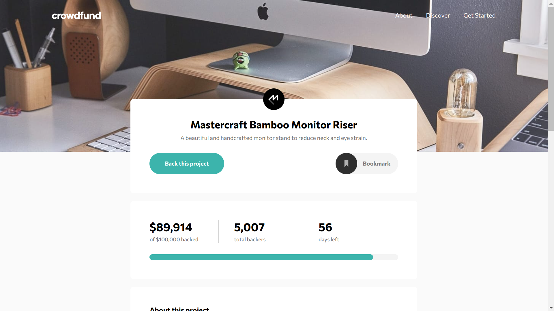
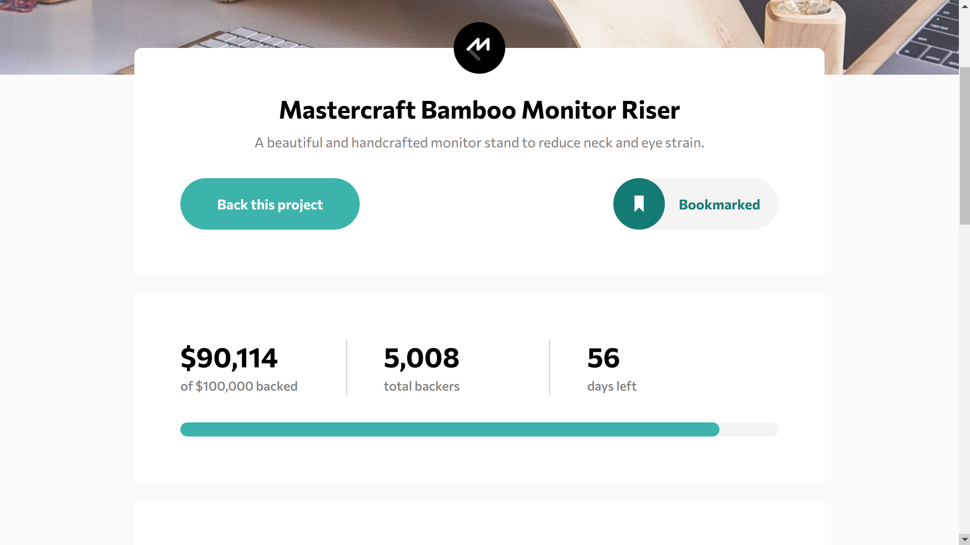
This project is my solution to a free coding challenge from Frontend Mentor. The main goal was to build out a crowdfunding product page and get it looking as close to as possible to the provided design previews.
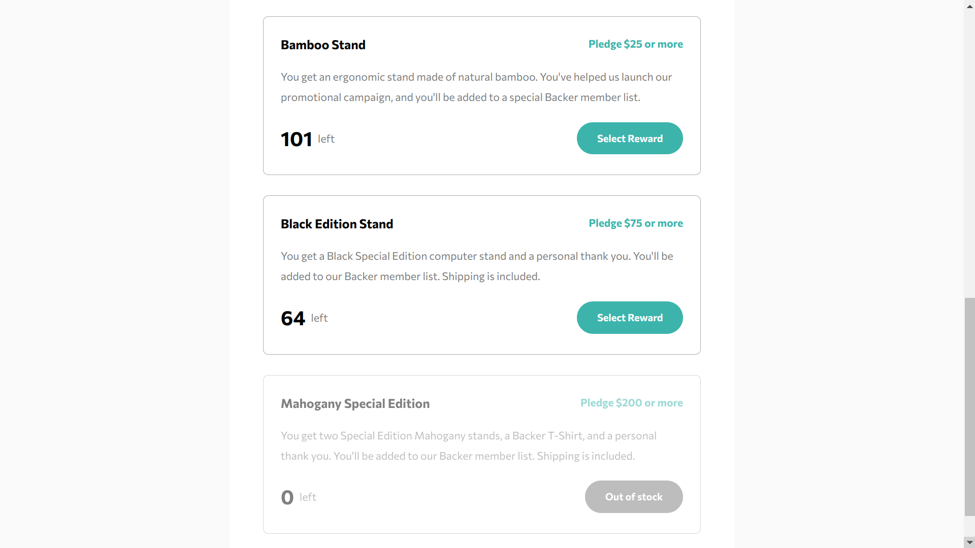
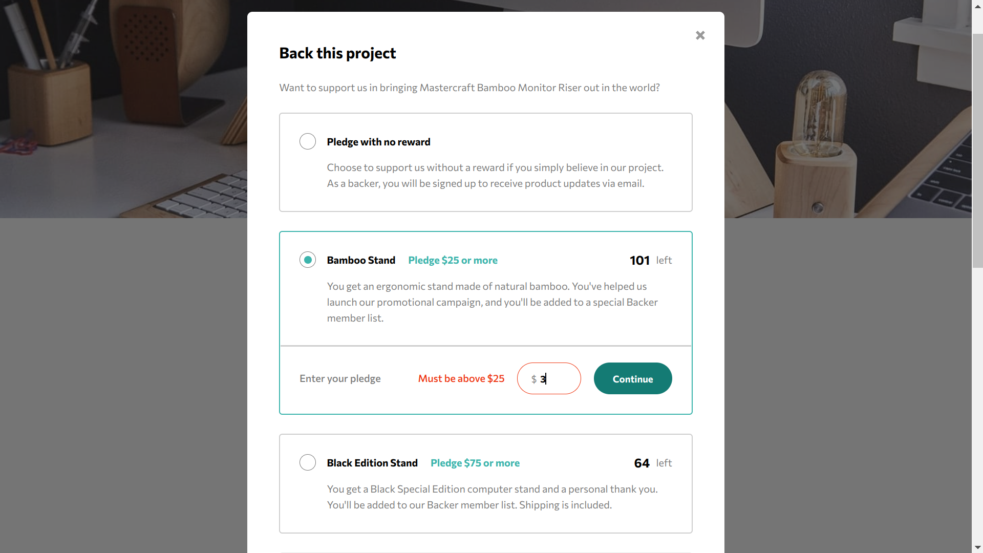
The site’s UI had to be fully responsive and interactive, allowing users to “bookmark” the product, select a pledge tier and amount, and see an updated backer count, total amount raised and number of units for each tier after a pledge was made.
I chose to use React, JavaScript and vanilla CSS for this challenge, which proved to be a great combo for building this site’s frontend. Not only did React’s components make building the UI more manageable, but React’s out-of-the-box state management (i.e. the useState() hook) worked quite well, even though a lot of prop drilling had to be used… 😅
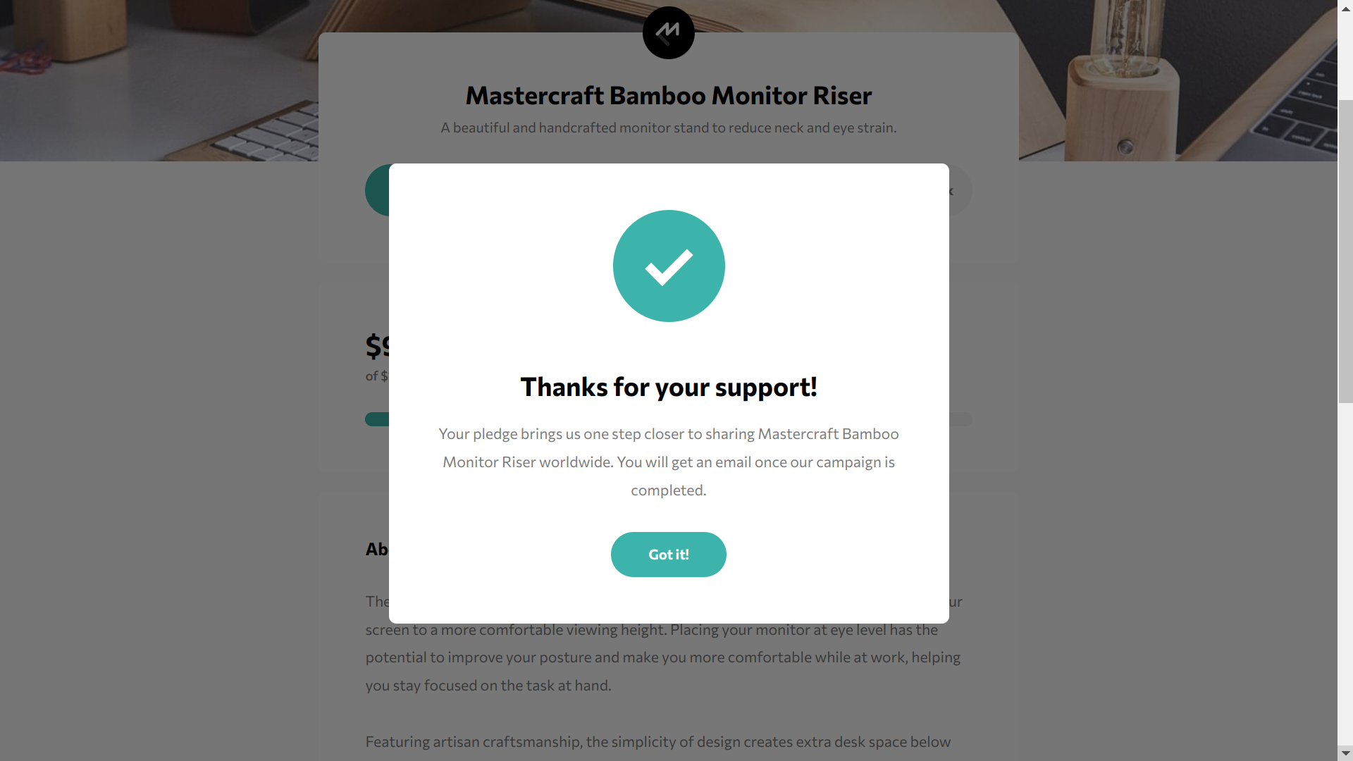
The site’s UI is polished, and looks quite nice on mobile devices. This page is also highly interactive thanks to React’s awesome features. I also added some extra features: clicking on different tier cards on the main home view will automatically scroll to the corresponding tier in the pledge modal - once a pledge is made, it also automatically scrolls to the completion modal as well. I also added some error handling to the pledge modal’s input fields, so that the pledge amount meets the minimum amount for each tier.
Overall, the end result meets the challenge’s goals and even goes a bit beyond. Despite only being rated as a Junior challenge on Frontend Mentor, this was honestly one of the more challenging projects ones I’ve completed so far, due to the sheer amount of state management required.


